Skip to content
IMH

Styles

Nancy Meyers Home Decor: Get the Look

Casual elegance, slipcovered sofas and the most copied kitchens in film - built from the method, not the square footage.

By Catherine Vizcaino · Home-renovation pro & founder

Updated October 2026

A warm kitchen with wood counters and decor

As an Amazon Associate, I Heart My Home earns from qualifying purchases. It never changes your price or our picks. Learn more.

Nobody searches for “Nancy Meyers home decor” because they want a movie poster. They want the rooms — the enormous cream-colored kitchen, the slipcovered sofa you could fall asleep on, the oatmeal linen and the warm lamplight at four in the afternoon. It is one of the only aesthetics named after a film director rather than a period or a place, and the reason it stuck is that the rooms in those movies are doing real work. Meyers has said as much: she considers her film set to function as a character, and she is described on the same page as meticulously involved in designing her films’ aesthetic details.

Now the part that changes how you shop for this. I have renovated enough houses to know when a reference photo is lying to you, and here the reference photos are not houses at all — they are sets. For The Holiday (2006), the crew found a genuine English cottage, decided it sat too far from London, and built the exterior instead in a field next to St James’s Church in Shere; the interiors were shot at Sony Pictures Studios. Amanda’s Los Angeles house is a 1928 Mission Revival by the architect Wallace Neff in San Marino on the outside, and a soundstage on the inside. So there is no address you can drive to and copy. Which is fine, because the thing actually worth copying is the method — and the method is on record.

Jon Hutman has been the production designer on Meyers’s films since What Women Want, including Something’s Gotta Give (which earned him an Art Directors Guild nomination for Excellence in Production Design) and It’s Complicated. In a June 2024 interview with Glamour (Anna Moeslein) he laid out how he does it, and it reduces to five rules you can use in a rental:

  • 1. Start with the room, not the stuff. “When I design a set, it always starts with the container of space.” Proportion, light and sightlines first. Nothing you buy fixes a room you have not looked at yet.
  • 2. Work with the architecture you actually have. “For me, places turn out better when you embrace the architecture that’s there.” A 1970s ranch styled as a Hamptons shingle house reads as costume. The same ranch styled honestly, in this palette, reads as expensive.
  • 3. Limit your choices on purpose. “Be simple and limit the number of aesthetic choices, whether it’s the furniture or the fabrics.” This is the rule people break. The Meyers look is not a lot of lovely things; it is a few, repeated.
  • 4. Aim for casual elegance, not elegance. Hutman calls it “this kind of casual elegance” and says “it is aspirational, but it’s comfortable,” because “elegant has always been a little stiff and uptight.” If a room cannot take a dog and a glass of wine, it is the wrong room.
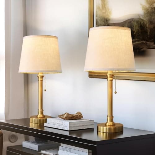
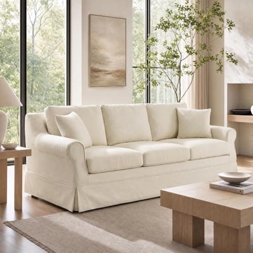
  • 5. Buy patina, and spend it on lamps. On lighting he looks for pieces where “there’s a patina of history that feels like it’s not brand-new,” and says of lamps that “timeless choices are always good.” On sofas he is even more specific: “natural color, canvas, slipcover.”

The ten pieces below are organized against those rules rather than by room — the sofa and the lamps because Hutman names them outright, then the fabrics, then the kitchen, because the kitchens are the part of these films that got the most media attention. A quick honesty note: Amazon prices move constantly, so the number on each card is pulled straight from Amazon on a refresh rather than typed in by me, and it can still change before you click — confirm on the listing. I earn a commission if you buy through one of these links; see the affiliate disclosure. And if you like this palette but want it lighter and airier, the coastal look is its closest relative.

Shop the look

The honest trade-off on every pick

Each card carries its own drawbacks, but here they are in one place — because this palette is almost entirely pale, natural and porous, and that has a maintenance bill attached:

  • Slipcovered sofa: the big spend here by a wide margin, and pale linen shows everything. Down cushions need plumping.
  • Brass lamps: brass finish, not solid brass, so no real patina. Small at about 19.5 inches.
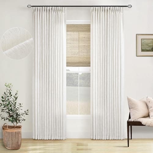
  • Pinch-pleat curtains: hooks and rings take an hour a window, and they filter light rather than blocking it.
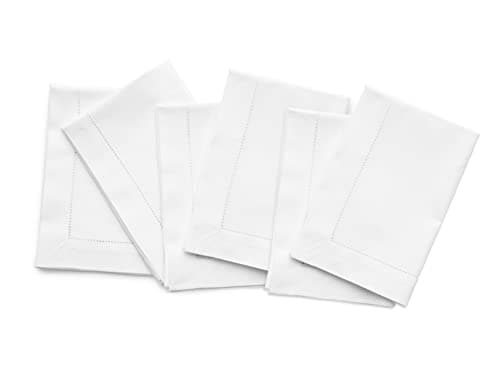
  • Linen napkins: they wrinkle, and a set of six runs out at a party of eight.
  • White dinnerware: shows cutlery marks, and a beaded rim is one more edge to chip.
  • Olive wood board: hand wash and oil only. A dishwasher will destroy it.
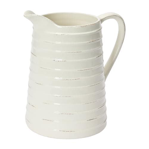
  • Distressed pitcher: the distressing varies, and some people read that as a defect.
  • Faux hydrangeas: they need dusting, and sun yellows white petals.
  • Straw market basket: sheds, frays and slumps when empty.
  • Unlacquered brass pulls: tarnishes on purpose, costs the most per pull, and five will not finish a kitchen.

The pattern is worth naming: six of these ten are pale, natural or unsealed, which means this is a look that asks for a little upkeep in exchange for feeling warm. If you want an aesthetic that shrugs off a household without any attention, this is the wrong one and I would rather tell you now.

Why you cannot copy a Nancy Meyers house

This sounds like a technicality and it is not. The houses people screenshot from these films largely do not exist as houses, and knowing that changes what you should be shopping for.

Take The Holiday. The crew went looking for an English cottage, found a genuine one, decided it was a considerable distance from London, and built the exterior from scratch in a field next to St James’s Church in Shere instead. The interiors were filmed at Sony Pictures Studios. On the California side, Amanda’s house is a real 1928 Mission Revival by the architect Wallace Neff in San Marino — but only on the outside; those interiors were shot on a soundstage too. Even the modern house in that film belongs to a different world entirely: it was designed by Richard Neutra, one of the defining mid-century modernists.

It’s Complicated is the same story with a different accent. Its house is described as a 1920s Spanish-ranch-style adobe-mud building chosen because it epitomized the Santa Barbara area — which is to say the aesthetic adapts to whatever architecture it lands in. That is Hutman’s second rule in practice, and it is the most useful thing on this page: these rooms are not one house style. They are one method applied to a shingled beach house, an English cottage, a Spanish adobe and a Brooklyn townhouse.

Which is genuinely good news if you live in a split-level or a 1990s builder colonial. You do not need the architecture. You need the palette, the restraint and the light. The money that would go into faking shingle-style trim is better spent on the sofa, the window treatments and the lamps — and on the rooms you actually use, which is where our living room ideas and kitchen ideas pages pick up.

The kitchen is the whole aesthetic

If the Meyers look has a center of gravity, it is the kitchen. Wikipedia notes plainly that the extravagant design and decoration of the kitchens in her films have received particular media attention, and Something’s Gotta Give picked up an Art Directors Guild nomination for Excellence in Production Design. The kitchen is where those films put their characters when something real happens.

Here is where I have to be straight with you, as someone who prices kitchens for a living. Those are large kitchens in expensive houses, and no amount of shopping reproduces square footage, window count or a six-foot island. What does transfer is a short list of decisions that have nothing to do with size:

  • Warm white, not cool white. The cabinets in these kitchens are cream and greige, never a blue-based builder white. This is a paint-chip decision that costs nothing extra.
  • Warm metal. Brass or bronze on the pulls and the faucet. Chrome and polished nickel read colder and immediately pull the room out of this palette.
  • Wood on the counter, not in the cabinets. A board, a bowl, a crock of utensils. The warmth comes from loose wood objects rather than wood-fronted cabinetry.
  • Things that get used, left out. Dishes on an open shelf, a basket by the door, flowers in a pitcher. Nothing in these kitchens is purely ornamental, and that is why they read as inhabited rather than staged.
  • One fabric at the window, repeated. Same panel, same color, every window. Rule three again.

Swapping hardware is the highest-leverage move on that list for most people — see our cabinet hardware roundup for sizing and finishes, and the kitchen faucets picks if the faucet is next.

Five ways the Nancy Meyers look goes wrong

I see the same five failures over and over, and four of them are violations of Hutman’s third rule.

  • Too many lovely things. This is the big one. People buy twelve beautiful neutral objects and end up with clutter in a nice color. “Be simple and limit the number of aesthetic choices” means the finished room has fewer things in it than you expect, repeated more often than you expect.
  • Beige with no texture. Smooth walls, smooth sofa, smooth everything reads flat and rental-grade. The straw, the olive wood and the linen weave are not accents here, they are structural.
  • Cool light. Every one of these rooms is lit warm and low. Daylight-white bulbs in an overhead fixture undo the entire palette after dark, no matter what you spent.
  • Fighting your own house. Shingle-style trim bolted onto a ranch, or a Hamptons palette in a dark basement apartment. Hutman’s own answer is to embrace the architecture that is there, and the results are better every time.
  • Precious instead of comfortable. A room you cannot put a mug down in has missed the point. The whole phrase is “casual elegance” — elegant on its own, in Hutman’s words, “has always been a little stiff and uptight.”

How it differs from the styles it gets confused with

Three looks sit close enough to this one that people mix them up, and the distinctions are genuinely useful when you are shopping.

Coastal is the nearest neighbor and shares most of the palette, but coastal pushes lighter and cooler — more white, more blue, more rattan and air. The Meyers version is warmer and heavier: cream rather than white, more upholstery, more lamplight, fewer open sightlines.

Modern farmhouse overlaps on the kitchen but diverges on sincerity. Farmhouse leans on signals — shiplap, barn doors, black metal, lettered signs. The Meyers look has no signals at all; it is upholstery, fabric and light, and it would rather look expensive than look rural.

Earth tones shares the warm-neutral instinct and the natural materials, but it runs through clay, terracotta, olive and espresso. This palette stays in cream, oatmeal and pale wood and lets brass be the only warm accent. If you like the restraint here but want more color, the earth-tone palette is where to go next.

Across all three, the furniture question is the same one, and our best sofas roundup and best furniture picks are the places to compare the anchor pieces properly.

Where to start if you only do one thing

In rough order of impact per dollar, which is not the order most people shop in:

  • Change the bulbs. 2700K everywhere, two or three lamps per room at seated height. Costs almost nothing and does the most.
  • Dress the windows properly. One pale pinch-pleat panel, mounted high and wide, repeated at every window in the room — our guide to hanging curtains has the measurements.
  • Swap the kitchen hardware. Warm metal on every pull. No trade required, and it changes the whole room’s temperature.
  • Put used things out. A board, a pitcher with stems in it, a basket by the door, white dishes on a shelf.
  • Then, and only then, the sofa. Natural color, canvas, slipcover — and buy it last, once the room around it already works.

If you are working to a number, our decorating on a budget guide covers which of those deserve the money, and cheap home decor has the small pieces. For the bedroom side of this palette — the white layered linens these films are equally known for — start with our bedding roundup.

Frequently asked questions

What is the Nancy Meyers aesthetic?

It is the interior look of Nancy Meyers’s films: warm cream and oatmeal neutrals, slipcovered upholstery, linen, natural wood, brass and soft lamplight, with a big comfortable kitchen at the center. Wikipedia notes the style has been dubbed the “Nancy Meyers aesthetic”, built on neutral paint colors, natural wood furniture, patterned textiles and vintage accessories. Her production designer, Jon Hutman, calls the effect “casual elegance” — aspirational, but comfortable.

Who designs the houses in Nancy Meyers movies?

Jon Hutman has been the production designer on her films since What Women Want, including Something’s Gotta Give — which earned an Art Directors Guild nomination for Excellence in Production Design, Contemporary Film — and It’s Complicated. Meyers is deeply involved herself; she is described as meticulously involved in her films’ aesthetic details and has said she treats the set as a character in the film.

Are the houses in Nancy Meyers movies real?

Mostly not, or only in part. For The Holiday, the crew found a real English cottage, decided it sat too far from London, and built the exterior in a field next to St James’s Church in Shere instead; the interiors were filmed at Sony Pictures Studios. Amanda’s Los Angeles house is a genuine 1928 Mission Revival by the architect Wallace Neff in San Marino — but only on the outside. So there is no one house to copy, which is why this page copies the method instead.

What colors are in the Nancy Meyers palette?

Warm cream, oatmeal, greige and soft white as the base, with pale natural wood, brass as the one metal accent, and small doses of muted blue or green in the textiles. Warmth is the whole thing: cream rather than a blue-based builder white, brass rather than chrome. Cool grays and stark bright whites flatten the scheme, and warm bulbs matter as much as the paint. If you want more color while keeping the warmth, look at earth tones.

How do I get the Nancy Meyers look on a budget?

Work in this order. Change the bulbs to 2700K and add two or three lamps at seated height. Hang one pale pinch-pleat panel, high and wide, at every window in the room. Swap the kitchen hardware to a warm metal. Then put used things out — a wood board, a pitcher with stems in it, white dishes on an open shelf, a basket by the door. The sofa is the expensive part, and it should come last, once the room around it already works. Our budget guide breaks the spending down further.

What is the difference between the Nancy Meyers look and coastal grandmother style?

They cover overlapping ground, and the newer label was coined partly to name this exact feeling. The useful distinction is temperature and weight: coastal runs lighter and cooler, with more white, more blue and more rattan, while the Meyers version is warmer and heavier — cream instead of white, more upholstery, more lamplight, fewer open sightlines. Both are built on neutral color and natural texture rather than any literal seaside motif.

Ready to make your space feel like home?

Browse the roundups I'd actually hand a client — honest picks, real trade-offs, and the one to buy first.