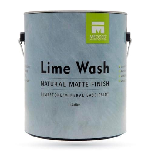
Meoded Authentic Lime Wash Paint, Fossil
Best for the wall layer
A mineral lime wash in a soft warm neutral that dries to a cloudy matte finish flat paint cannot fake.
$91.70 · View on Amazon
#ad · disclosure · Price as of October 22, 2026
Styles
Clay, khaki, olive and stone - the palette the paint industry just voted for, and how to build it without repainting the whole house.
By Catherine Vizcaino · Home-renovation pro & founder
Updated October 2026
As an Amazon Associate, I Heart My Home earns from qualifying purchases. It never changes your price or our picks. Learn more.
“Earth tones” gets used so loosely that it has almost stopped meaning anything. So here is the working definition I use on job sites: an earth tone is a color you could point at out a window. Clay and terracotta, khaki and oatmeal, olive and moss, walnut and chocolate, limestone and travertine gray. What they share is not a hue — they run from near-white to near-black — it is a warm, slightly muddy undertone. Nothing in the palette is a pure, clean, mixed-in-a-lab color, and that is exactly why a room full of them feels calm instead of busy.
The reason you are seeing “earth tone revival” everywhere right now is that the paint industry put real money behind it for 2026. Sherwin-Williams named Universal Khaki (SW 6150) its 2026 Color of the Year, calling it “an essential, mid-tone neutral that invites both timeless simplicity and bold color exploration.” Benjamin Moore named Silhouette (AF-655), “an alluring mix of rich espresso hues with subtle notes of charcoal,” and surrounded it with an eight-color palette that includes Southwest Pottery, Sherwood Tan and Batik. A khaki and an espresso, from the two biggest paint brands in the country, in the same year. That is not a coincidence, and it is the single most useful signal in the whole 2026 trend conversation, because paint companies commit a year ahead and have to be right.
Here is the part most trend articles skip, and the reason this page exists. Earth tones are not a color you buy — they are a stack of five material layers, and the order you build them in decides whether the room reads expensive or muddy. Get this sequence right and almost any combination works:
The ten pieces below are one per layer plus a few doubles, chosen so that between them they cover all five. A quick honesty note: Amazon prices move constantly, so the number on each card is pulled straight from Amazon on a refresh rather than typed in by me, and it can still change between that refresh and your click — always confirm on the listing. I earn a commission if you buy through one of these links; see the affiliate disclosure for how that works. If you want the furniture-first version of this look, the rustic style guide is its closest cousin and shares most of the palette.
Best for the wall layer
A mineral lime wash in a soft warm neutral that dries to a cloudy matte finish flat paint cannot fake.
#ad · disclosure · Price as of October 22, 2026
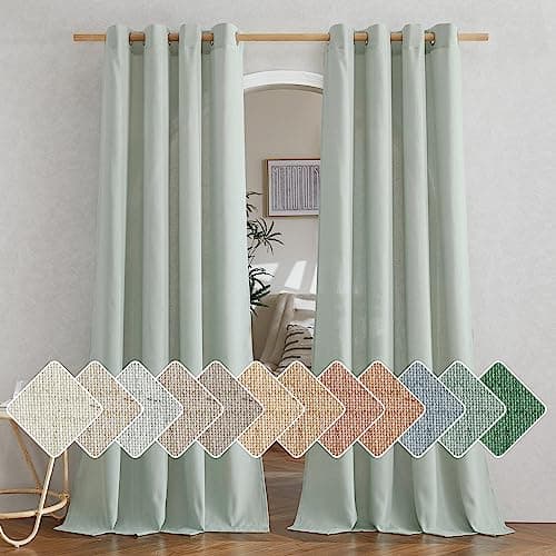
Best for the green note
Light-filtering flax-blend panels in a muted sage that turn window light warm instead of blocking it.
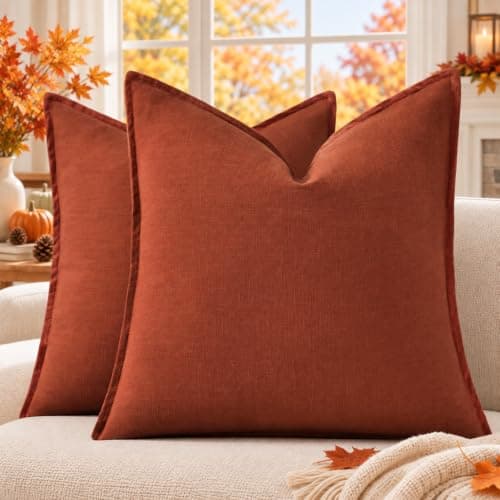
Best for the warm accent
A pair of flanged linen-look covers in rust - the one genuinely saturated color the palette allows.
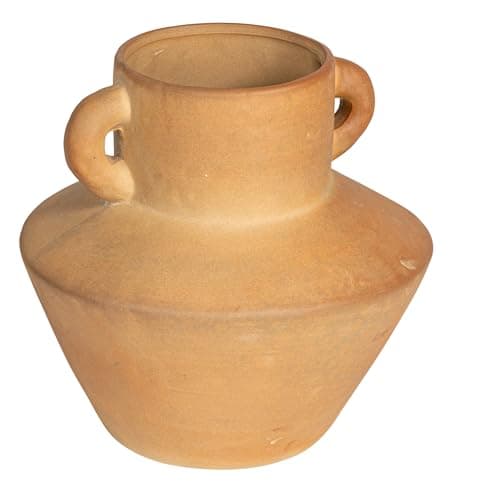
Best for the clay layer
A handled stoneware vase in terra cotta with a reactive glaze, so no two pieces finish quite the same.
#ad · disclosure · Price as of October 22, 2026
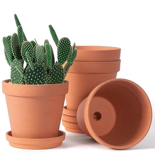
Best for unglazed clay, repeated
Four plain unglazed terracotta pots with drainage and matching saucers - the cheapest real clay in the palette.
#ad · disclosure · Price as of October 22, 2026
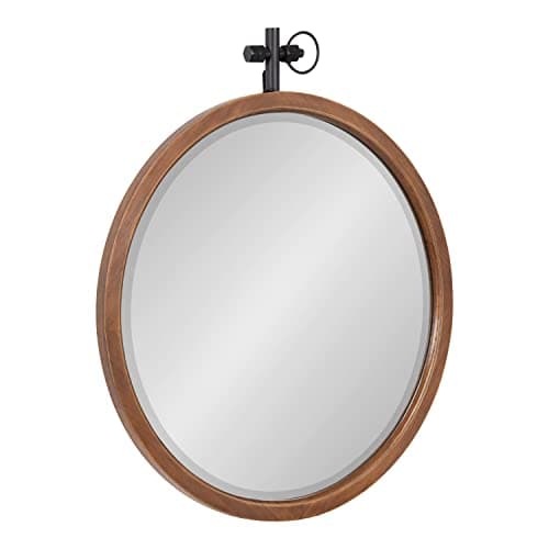
Best for the warm wood note
A 24-inch round mirror in a walnut-brown wood frame that adds the brown layer and bounces warm light at the same time.
#ad · disclosure · Price as of October 22, 2026
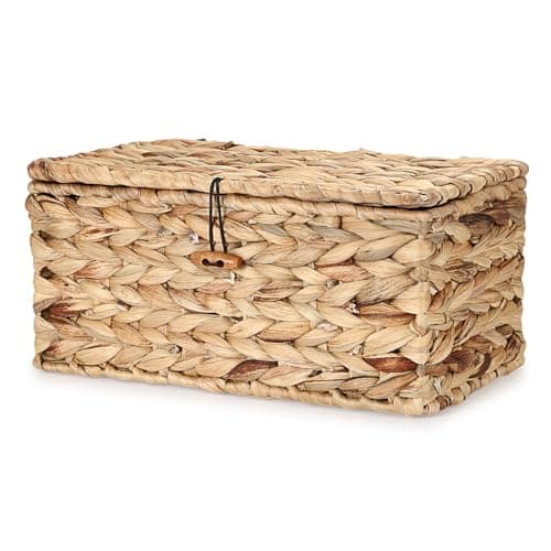
Best for the woven texture
A lidded water hyacinth box that hides clutter while adding the natural-fiber texture the palette needs.
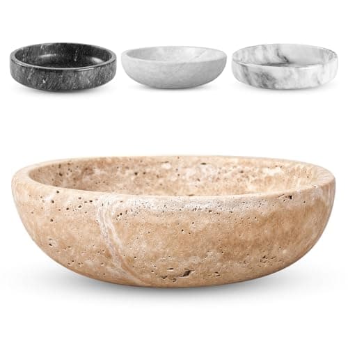
Best for the stone layer
A shallow natural travertine catchall whose pitted beige surface brings real stone into the palette.
#ad · disclosure · Price as of October 22, 2026
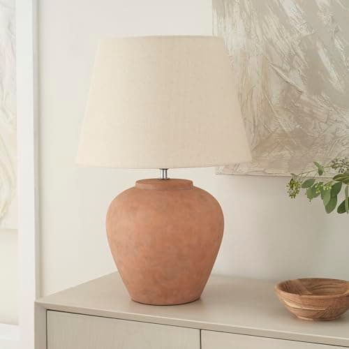
Best for the light layer
A terracotta-glazed ceramic lamp with a neutral fabric shade - the warm light the palette lives or dies on.
#ad · disclosure · Price as of October 22, 2026
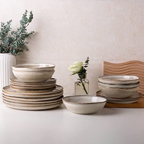
Best for carrying the palette to the table
A twelve-piece reactive-glaze stoneware set in a warm cappuccino brown that reads like small-batch pottery.
#ad · disclosure · Price as of October 22, 2026
Each card above lists its own drawbacks, but here is the short version in one place, because the fastest way to regret an earth-tone room is to buy the material without the maintenance that comes with it:
Nothing on that list is a dealbreaker. But four of the ten are porous natural materials, and porous materials ask for one small act of care — a sealer, a saucer, a dry room. That is the actual cost of this palette, and it is worth knowing before you order.
I am skeptical of most color trends, because the people announcing them are usually selling the thing they just announced. Earth tones for 2026 are the rare case where the evidence is unusually strong, and it comes from the companies with the most to lose from being wrong.
Sherwin-Williams built its 2026 program around Universal Khaki, SW 6150, which its own color of the year page calls “an essential, mid-tone neutral that invites both timeless simplicity and bold color exploration.” Benjamin Moore chose Silhouette, AF-655, described in its announcement as “an alluring mix of rich espresso hues with subtle notes of charcoal.” And it did not stop at one color: the Color Trends 2026 palette it published alongside Silhouette runs eight deep — Silhouette AF-655, Raindance 1572, Swiss Coffee OC-45, First Crush CSP-310, Batik AF-610, Narragansett Green HC-157, Southwest Pottery 048 and Sherwood Tan 1054. A tan, a terracotta-adjacent pottery shade, a deep green and an espresso, published as a set.
Why that matters more than a magazine spread: paint companies lock these decisions in roughly a year ahead, then order pigment, print fan decks, retrain store staff and build retail displays around them. That is a real commitment with a real cost, which makes it far better evidence of where the market is going than any list of predictions.
Now the honest counterweight, because a trend page that only reports agreement is not telling you much. Not every 2026 forecast went warm. Pantone named Cloud Dancer, PANTONE 11-4201 — a white — as its 2026 Color of the Year. So the picture is not unanimous, and anyone telling you earth tones are the only direction for 2026 is overselling it. What the paint brands agree on is narrower and more useful: the warm, grounded, brown-and-khaki end of the neutral range is where residential interiors are heading. That is enough to act on, and it is the claim this page is built around.
Which brings up the obvious question about the decade of cool gray that came before. Gray is not banned, and you do not need to repaint. Warm it up instead: a clay vase, an olive textile, a walnut frame and 2700K bulbs will pull a cool-gray room surprisingly far toward warm for very little money. For the wider picture, the 2026 decor trends page covers how the rest of the year lines up with this.
The five layers in the intro are a sequence, not a shopping list. Working through them in order is what keeps an earth-tone room from turning into a beige room with accessories in it.
If you are doing this on a tight number, our guide to decorating on a budget covers which of those layers deserve money and which do not, and the area rugs roundup is where I would start on the floor — a natural-fiber jute base is the default under this palette, and it is a layer I deliberately left off the list above because it deserves its own comparison.
This palette is forgiving, but it fails in predictable ways. These are the five I run into most:
Not every room wants this palette equally, and knowing where to start saves money.
Living rooms are the natural home for it. It is where you have the most textiles, the most surfaces to put clay on, and the most control over lighting. A khaki wall, one rust accent, a jute base layer and two warm lamps is a complete scheme — our living room ideas page covers the arrangement side. Bedrooms are the second-best candidate, because the palette is genuinely restful and bedrooms are where you most want light to be warm and low.
Kitchens and dining rooms take the palette well through tabletop and open shelving rather than through paint — brown stoneware, a wood board, a clay pitcher. It is the cheapest earth-tone room to do, because you are buying things you would own anyway.
Entryways punch above their weight: a stone catchall, a walnut mirror and a lidded basket is three layers in four square feet, and it is the first thing anyone sees — the wall mirrors roundup has more shapes and sizes if the round walnut above is not the one. Bathrooms are the one place I would be careful. The palette depends on natural fiber and porous stone, and both of those are poor choices in a room that gets steamed twice a day. Use sealed and glazed versions there, or skip the fiber entirely.
One last note on seasons. Because this palette is built on warm browns, rust and olive, it transitions into fall decor with almost no effort — which is a real practical advantage. A room decorated this way needs very little seasonal swapping, and what you do swap stays in the same family all year.
Earth tones are colors you could point at out a window: clay and terracotta, khaki and oatmeal, olive and moss, walnut and chocolate, and warm stone grays like travertine. They are not a single hue — they run from near-white to near-black. What they share is a warm, slightly muted undertone, with none of the clean saturation of a lab-mixed color. That is why a room built on them reads as calm rather than busy.
Yes, and the strongest evidence is commercial rather than editorial. Sherwin-Williams named Universal Khaki SW 6150 its 2026 Color of the Year and Benjamin Moore named Silhouette AF-655, an espresso with charcoal notes, alongside an eight-color 2026 palette that includes Sherwood Tan, Southwest Pottery and Batik. Paint companies lock those decisions in a year ahead and buy pigment against them. It is not unanimous — Pantone went the other way with Cloud Dancer, a white — but the residential paint market has clearly moved warm.
Only if you skip two things. The first is texture: beige walls, beige sofa and a beige rug with every surface smooth reads flat, so the palette needs rough materials — jute, unglazed clay, raw stone, loose-woven linen. The second is light. Use 2700K to 3000K bulbs in two or three sources at different heights; a cool 4000K bulb grays out every warm surface in the room. And put your deepest tones on furniture before walls, especially in a room with one window.
Clean, high-saturation colors are the problem — a true royal blue or a pure primary red next to clay and khaki makes the earth tones look dirty rather than warm. Cool blue-based grays fight the palette too. On metals, chrome and polished nickel clash; brass, bronze, matte black and raw wood all sit right. If you want a brighter color anyway, pick a muted version of it and repeat it at least twice so it reads as a choice.
Start with the reversible layers. Two rust or olive linen pillow covers, one terracotta stoneware vase, a natural-fiber rug and a woven basket will move a neutral room a long way, and none of it is permanent. Then swap the bulbs for 2700K to 3000K, which costs almost nothing and changes the most. Our throw pillows roundup and cheap home decor picks are both good places to shop that list.
A neutral palette just means low saturation, and it can be warm or cool — which is how a decade of cool-gray rooms qualified as neutral. Earth tones are specifically warm and specifically borrowed from natural materials, and the group includes genuinely saturated colors like rust, olive and espresso that nobody would call neutral. So every earth tone is muted, but plenty of neutrals are not earth tones.
Browse the roundups I'd actually hand a client — honest picks, real trade-offs, and the one to buy first.