
Klyyo Clyro Paint Sample Boards, 12 x 9 inch, 5-Pack
Best for testing the color before you commit
Five blank 12-by-9-inch white polystyrene panels you paint and carry around the room, instead of trusting a two-inch chip.
Styles
One color on every surface - the 2026 bold-color move that works beautifully, right up until the prep catches you out.
By Catherine Vizcaino · Home-renovation pro & founder
Updated October 2026
As an Amazon Associate, I Heart My Home earns from qualifying purchases. It never changes your price or our picks. Learn more.
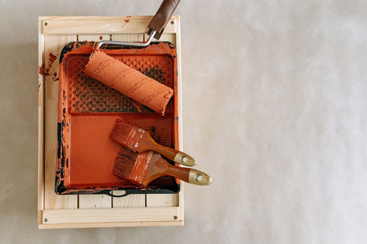
Color drenching is the cheapest expensive-looking thing you can do to a room, and it is also one of the easiest to get wrong. The idea is one color on everything. Farrow & Ball, whose own how-to helped make the technique famous, puts it about as plainly as it can be put. It “simply means painting everything the same shade: the walls, woodwork, ceiling and even radiators or furniture”. No white trim, no white ceiling, no break where one surface stops and the next begins.
What that does to a room is remove every line your eye normally stops at. An ordinary room is full of them — white baseboard against a colored wall, white casing around each door, a white ceiling line overhead — and every one of those lines chops the space into pieces. Take them out and the room reads as a single continuous volume. That is why drenched rooms photograph so well. It is also exactly why they so often disappoint in person: the technique has no contrast left to hide behind, so every gap, every nail hole and every lighting problem in the room becomes the most interesting thing in it.
This is no longer a fringe idea, either. For 2026 the residential paint brands went deep and saturated almost across the board. Benjamin Moore named Silhouette AF-655 its Color of the Year, “an alluring mix of rich espresso hues with subtle notes of charcoal,” with Andrea Magno, its director of color marketing and design, saying “like a perfectly tailored suit, this hue has the versatility.” Behr named Hidden Gem, “a smoky jade that adds depth and elegance to any room,” which Anna Miller, The Home Depot’s director of trend and design, called “a confident choice for anyone looking to create soulful, personal spaces.” Valspar named Warm Eucalyptus 8004-28F, a green its color marketing director Sue Kim called “more than just a beautiful shade of green.” Sherwin-Williams was the outlier and held at a mid-tone neutral, Universal Khaki SW 6150 — and even its own description sells the point, describing a neutral “that invites both timeless simplicity and bold color exploration.”
The honest counterweight, because I do not think color-of-the-year announcements should be read as prophecy: Pantone went the other way entirely and named Cloud Dancer PANTONE 11-4201, an off-white. So the agreement for 2026 is specifically among the companies that sell wall paint, which is worth knowing before you treat any of it as a forecast rather than a product launch.
What follows is the how, not the mood board. Ten things in the order you actually need them: one to test the color before you commit five surfaces to it, two to fix what a drench exposes, two to prime what paint will not otherwise stick to, three to get paint onto five different surfaces, and two for the details that give a drenched room away. Amazon prices move constantly, so the number on each card is pulled from Amazon on a refresh rather than typed in by me — confirm it on the listing before you buy. I earn a commission if you buy through one of these links, at no extra cost to you; see the affiliate disclosure. If you want bold color without committing every surface to it, the maximalist approach gets there with pattern instead, and the 2026 decor trends guide puts drenching in context with the rest of the year.
Best for testing the color before you commit
Five blank 12-by-9-inch white polystyrene panels you paint and carry around the room, instead of trusting a two-inch chip.
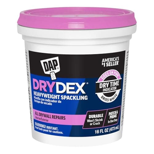
Best for the nail holes a drench exposes
Spackling that goes on pink and turns white when it is ready to sand, so dry time stops being a guess.
#ad · disclosure · Price as of November 3, 2026
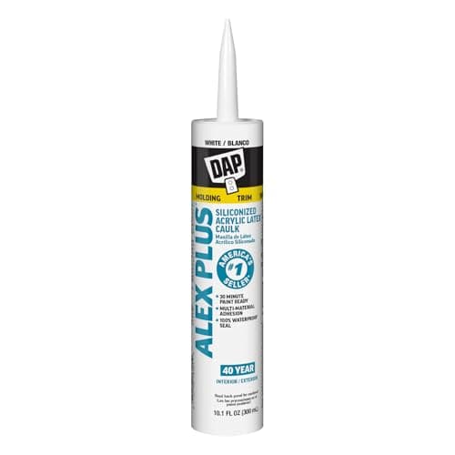
Best for the gap between trim and wall
A paintable acrylic latex caulk for the hairline gaps where baseboard, casing and crown meet the wall.
#ad · disclosure · Price as of November 3, 2026
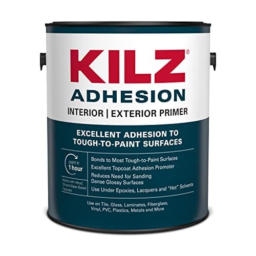
Best for glossy or oil-based woodwork
A bonding primer for the slick, previously glossed trim that ordinary wall paint peels straight back off.
#ad · disclosure · Price as of November 3, 2026
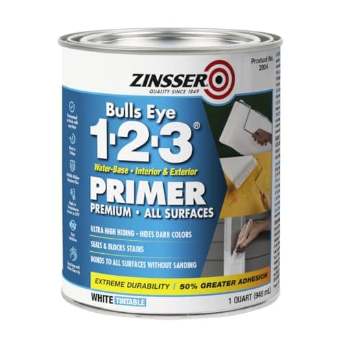
Best for spot-priming patches so they do not flash
A quart of all-surface water-based primer-sealer for the filled holes, bare patches and repairs before color goes on.
#ad · disclosure · Price as of November 3, 2026

Best for woodwork, panel molding and radiators
The standard 2-1/2 inch angled sash brush, with a firm nylon/polyester blend and a hardwood handle.
#ad · disclosure · Price as of November 3, 2026

Best for doors and flat trim, smoothly
A 4-inch frame and two high-density foam covers for laying a smooth film on doors, flat casing and cabinet faces.

Best for the ceiling, which is the surface people skip
A threaded 3-to-6-foot extension pole, so the ceiling gets two proper coats instead of one tired one.
#ad · disclosure · Price as of November 3, 2026
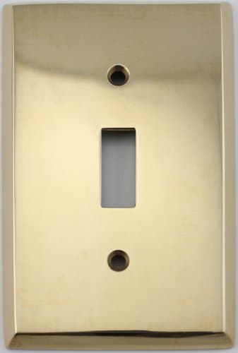
Best for the white plastic that ruins a drench
An unlacquered brass single-toggle plate to replace the builder-white plastic interrupting every drenched wall.
#ad · disclosure · Price as of November 3, 2026

Best for giving a dark room its light back
A cordless rechargeable picture light in a brass finish - dimmable, three color temperatures, remote, no wiring.
#ad · disclosure · Price as of November 3, 2026
Each card above carries its own drawbacks, but here is the short version in one place, because a drench is a prep project wearing a decorating project’s clothes and the costs are not where people expect them:
Notice the pattern. Six of the ten are prep and application rather than decor, and that is the real shape of this project. Color drenching is cheap in materials and expensive in preparation, which is the opposite of how most people budget a room. So if you are going to cut something, cut the brass plate and the picture light — not the caulk and the primer.
Four different things get called color drenching, and only one of them is. Knowing the difference saves you from buying for the wrong technique.
The honest catch with a true drench is that it flattens architectural detail. If you have good original moldings, deep casing or a handsome crown, drenching makes them recede into the field — you keep the shadow and lose the outline. Whether that is a loss or a gift depends entirely on what your trim looks like. In a house with builder-grade colonial casing from the 1990s, making it vanish is the best thing you can do for the room. In a house with original 1920s woodwork, think hard first.
The other thing worth borrowing from Farrow & Ball’s own guide is that the technique is not inherently moody. Taking a light or mid-tone shade over the ceiling as well blurs the line where the walls stop, which the brand says can make a room feel bigger and airier — and it singles out narrow hallways as the place this works best. Darker tones are the ones it recommends for rooms you use in the evening, “creating a cosy cocoon of colour.” Both of those are drenches. They do completely different things to a room.
A drench magnifies whatever you choose, so the color decision carries more weight here than it would on one wall. Three rules I use, in order.
One: test big, in the room, over two days. A two-inch chip held against a white wall is actively misleading, because the white next to it shifts how you read the color. Paint two full coats on a large movable panel, let it dry, then carry it to the window, to the darkest corner and to the wall opposite the door. Look at it in morning light, in late-afternoon light and with the lamps on. A color that survives all three is the one to buy.
Two: look up the LRV before you fall in love. Light reflectance value is a number from 0 to 100 that every major paint brand publishes on each color’s own page — 0 being black, 100 being white — and it tells you how much light that color will give back to the room. It is the most useful number in paint and the least used. The practical point for a drench is that the same color behaves very differently depending on which way your windows face: a north-facing room gets cool, indirect light all day and will read every color darker and grayer than the swatch promised, while a south-facing room flatters almost anything. If you are drenching a north-facing room, go a step lighter and a step warmer than you think you want.
Three: let the brands do the palette work. If you want a bold color palette that has already been checked for how it behaves on a wall rather than on a screen, the paint companies publish exactly that every year. Benjamin Moore’s Color Trends 2026 collection is eight colors wide — Silhouette AF-655, Raindance 1572, Swiss Coffee OC-45, First Crush CSP-310, Batik AF-610, Narragansett Green HC-157, Southwest Pottery 048 and Sherwood Tan 1054 — which hands you the espresso, the green and the warm off-whites in one tested family. Valspar pairs its Warm Eucalyptus 8004-28F with Degas Blue 8004-35B as the lighter companion and Groundbreaking 8005-8F for contrast. Those are published palettes, not guesses, and they are a far better starting point than a screenshot.
One more practical filter: match the undertone to what you are not repainting. Your floor, your countertop and your fixed wood are staying put, and a warm drench against a cool gray-brown floor will fight you all day. If you want the warm end of this, our earth-tone palette guide breaks the clay-khaki-olive family into the material layers that go with it. To get from a thousand colors down to a shortlist worth sampling, the paint-company apps in our best home decorating apps guide will read your room and recommend against what is already in it — then post you the peel-and-stick samples, which is the part that actually decides it.
Sequence matters more in a drench than in a normal paint job, because you are working one color onto surfaces that would usually be masked off from each other. Gravity decides the order.
Then the sheen question, which is where most of the real disagreement lives. There are two defensible answers.
The single-product route is one paint, one sheen, everywhere. This is what Farrow & Ball recommends for a drench, and it is why they point people at Dead Flat — described on their own product page as “our most matt finish with added toughness,” one that is “washable, wipeable and scuff resistant” and can be taken “across your walls, woodwork and metal.” An ultra-matte finish on everything is the purest version of the effect, because there is no sheen change at all to hint at where one surface ends.
The two-sheen route keeps the color identical and changes only the finish: matte or eggshell on walls and ceiling, satin or semi-gloss on woodwork and doors. You lose a little of the seamless effect and you gain woodwork you can actually clean. In a hallway, a kid’s room or a kitchen I take the second route every time, because flat paint on a baseboard in a busy house looks tired inside a year. In a bedroom or a study, the single-sheen version is worth it. What you should not do is put ordinary wall paint on the woodwork and hope — that is the choice that gets undone first.
If you have never painted trim before, our guide to painting furniture covers the same prime-and-tip technique on a smaller, more forgiving surface, and the furniture paint roundup is the place to compare finishes.
I see the same five failures over and over, and only one of them is about the color.
Some rooms are made for this and some are a fight. Roughly in order of how reliably it works:
Hallways and entries are the best first project in most houses, and Farrow & Ball agrees — its own guide singles out narrow hallways as the place a light or mid-tone drench makes the space feel wider, precisely because there is no ceiling line left to tell you how tight the corridor is. A hall is also small, has almost no furniture to move, and nobody stands in it long enough to tire of a bold choice. Our entryway ideas cover the rest of the layering.
Powder rooms are the other obvious starter: four small walls, no natural light to ruin, and a room you are in for ninety seconds. This is where to try the color you are not brave enough to live with.
Studies and home offices work well because the absence of contrast is genuinely restful to sit in for hours. Farrow & Ball names offices and nurseries for exactly that reason — a same-shade scheme avoids strong contrasts and harsh lines. The caveat is video calls: a dark drenched wall behind you needs a light source on your face, not just in the room. See home office ideas.
Bedrooms are the classic deep drench, because a room you mostly use after dark is the right place for a color that needs lamplight. Pair it with a window treatment in the same tonal family rather than a white panel, which would reintroduce the contrast line you just removed — our curtain roundup has the options and the measuring rules.
Kitchens are harder, not because of the color but because of the surfaces. Cabinets, backsplash, counters and appliances are all materials you are not painting, so a kitchen drench is usually a wall-and-ceiling drench with the cabinets treated separately. It can be beautiful. It is not a weekend.
Open-plan living spaces are the one place I would push back. Without a cased opening or a ceiling change to stop at, the color has no edge, and the enveloping quality that makes a drench feel deliberate just evaporates across forty feet. If that is your layout, drench the one room that closes — the office, the powder room, the guest room — and use color on a smaller scale everywhere else.
Rentals are a maybe, and the honest answer is that it depends on your lease. A drench is paint, which is reversible, but reversing a deep color means priming and repainting five surfaces rather than one. If you cannot paint at all, the renter-friendly route to the same enveloping effect is a dark tonal wall treatment — see our peel-and-stick wallpaper picks and renter-friendly decor ideas.
In rough order of impact per dollar, which is not the order most people shop in:
If you are working to a number rather than a wish list, our decorating on a budget guide covers which parts of a room makeover deserve the money. And if after all this you decide you want the bold color without committing every surface to it, the maximalist route gets you there through pattern and layering instead.
It means painting every surface in a room the same single color — walls, woodwork, doors, the ceiling, and even radiators or built-ins. Farrow & Ball’s own guide describes it as painting everything the same shade: the walls, woodwork, ceiling and even radiators or furniture. The point of removing the contrast lines between surfaces is that the room stops reading as a set of separate planes and starts reading as one continuous volume.
Yes, and that is the step that separates a drench from an accent wall or a two-tone scheme. The ceiling is named explicitly in Farrow & Ball’s own definition, and the brand points out that taking color overhead blurs the line where the walls meet the ceiling — which is exactly what lets a light or mid-tone drench feel bigger and airier rather than smaller. Painting the ceiling a lighter tint of the wall color is a tonal scheme rather than a drench. That is a perfectly good choice; it is just a different one.
Not automatically — it depends how light the color is. Farrow & Ball says light or mid shades can make a room feel bigger and airier precisely because the line where walls meet the ceiling is blurred, and it recommends the approach especially for narrow hallways. Deeper tones genuinely do read cozier and more enclosed, which the same guide frames as a “cosy cocoon of colour” for rooms you use in the evening. A pale drench can open a room up; a dark drench draws it in on purpose. Same technique, opposite result.
Two answers are both defensible. One paint and one sheen everywhere gives the purest effect, which is why Farrow & Ball points people at Dead Flat — their “most matt finish with added toughness,” described as “washable, wipeable and scuff resistant” and usable “across your walls, woodwork and metal.” The alternative keeps the color identical and changes only the finish: matte or eggshell on walls and ceiling, satin or semi-gloss on woodwork and doors. You trade a little of the seamless look for trim you can clean, which is the right trade in a hallway, a kitchen or a kid’s room. What does not work is putting ordinary wall paint on the woodwork and hoping.
Usually, but not everywhere — and there are two different priming jobs. Filled and sanded patches need spot-priming with an all-surface primer-sealer, or they flash: they dry duller and blotchier than the wall around them and show through two topcoats. Glossy or old oil-based woodwork needs a bonding primer, because latex will not grip a semi-gloss enamel and the baseboard paint will peel off in a sheet months later. Bare drywall, or trim that is already flat and clean, can often take color directly. And if you are going deep, have the primer tinted toward the topcoat — it is usually free, and it is the cheapest way to get full coverage in two coats rather than three.
The residential paint brands went deep and saturated for 2026, which hands you tested starting points rather than guesses. Benjamin Moore named Silhouette AF-655, “an alluring mix of rich espresso hues with subtle notes of charcoal,” inside an eight-color Color Trends 2026 palette that also holds Raindance 1572, Swiss Coffee OC-45, First Crush CSP-310, Batik AF-610, Narragansett Green HC-157, Southwest Pottery 048 and Sherwood Tan 1054. Behr named Hidden Gem, a smoky jade. Valspar named Warm Eucalyptus 8004-28F, with Degas Blue 8004-35B and Groundbreaking 8005-8F as its companions. Sherwin-Williams held at a mid-tone neutral, Universal Khaki SW 6150. In fairness, Pantone named Cloud Dancer 11-4201, an off-white — so the 2026 agreement is specifically among the companies selling wall paint, not a universal verdict.
It is often the best place for it, as long as you plan the light. Small rooms with little natural light get the most out of a drench, because there is less to fight and the enveloping effect is strongest in a space you take in all at once — powder rooms, halls, studies and guest rooms are the usual first projects. What you have to plan for is that a saturated color absorbs light instead of bouncing it. Two or three warm, low sources at 2700K matter more here than the paint does; one overhead fixture flattens the color and is the single most common reason a drenched room reads as a cave rather than a cocoon.
Browse the roundups I'd actually hand a client — honest picks, real trade-offs, and the one to buy first.