Nearly Natural Faux Eucalyptus Stems
Best for adding height and life
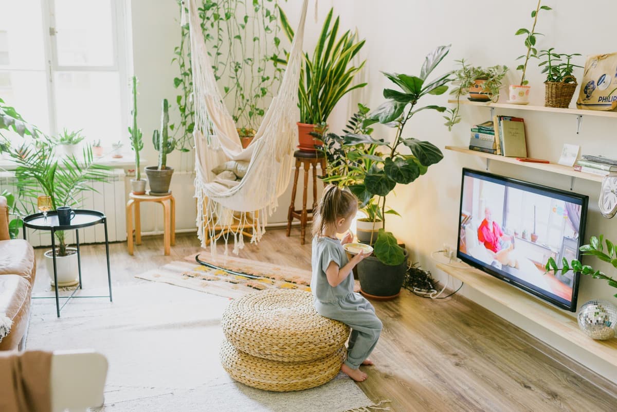
Realistic faux greenery that adds a soft vertical element and a bit of life to any shelf vignette.
Guides
Mix your books, work in odd numbers, layer front to back, and leave room to breathe.
By Catherine Vizcaino · Home-renovation pro & founder
Updated August 2026
As an Amazon Associate, I Heart My Home earns from qualifying purchases. It never changes your price or our picks. Learn more.
A well-styled bookshelf is one of the highest-impact things you can do in a room with stuff you probably already own. The trouble is that most shelves go one of two wrong ways: crammed wall-to-wall like a used bookstore, or lined up in a stiff, evenly spaced row like a retail display. The designed look sits in between — grouped, layered, and deliberately unfinished in a way that feels collected over time.
Here’s how I style shelves on a job, broken into rules you can follow shelf by shelf. Almost all of it is free: you’re rearranging books, shopping your own house, and adding a few small objects. If you’re still shopping for the shelf itself, start with the best bookshelves, and if this is for a workspace, the home office guide covers how the shelving fits the rest of the room.
For any small objects you do end up buying, the cards below show a Check price on Amazon button rather than a set price, since decor prices move constantly. And if styling shelves gives you the itch to make something, pair this with DIY home decor ideas for a few weekend projects.
Best for adding height and life
Realistic faux greenery that adds a soft vertical element and a bit of life to any shelf vignette.
Best for a sculptural anchor object
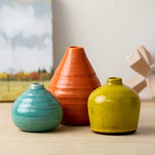
A matte ceramic vase that works as a standalone sculptural object or a home for a few faux stems.
Best for layering at the back
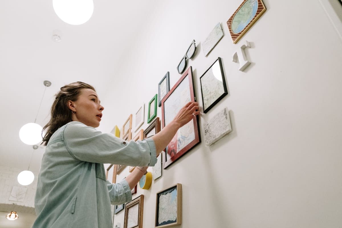
A small framed print made to lean against the back of a shelf and add front-to-back depth.
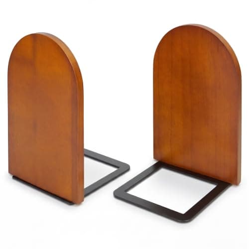
Best for corralling vertical books
A solid pair of bookends that keeps vertical rows upright and doubles as a small decorative object.
Books are your raw material, and how you stack them sets the whole tone. The mistake is standing every book upright in one long, even row. Designers break that up:
You don’t need beautiful books to start — a stack turned spine-in or wrapped in kraft paper hides loud jackets and gives you a neutral base to build on.
Style each shelf as a small collection, or vignette, rather than a place to store one of everything. Two rules do most of the work: work in odd numbers, and vary the height.
This triangle-and-odd-numbers idea is a cousin of the rule of thirds photographers use: off-center, uneven arrangements are simply more interesting to look at than perfectly centered, evenly spaced ones.
Flat shelves look flat. Depth is what makes a shelf look styled by a professional, and you build it by layering from the back of the shelf forward.
Then add life and variety of material: a bit of greenery or a few faux stems, one natural texture (a wood bowl, a woven box), something ceramic, and maybe one metallic or glass piece to catch light. Repeating a couple of materials across the shelves is what ties separate vignettes into one cohesive display.
The step almost everyone skips is the most important: take things away. A shelf that’s two-thirds full reads as intentional and calm; a shelf packed corner to corner reads as clutter, no matter how nice each object is. Negative space is what lets the pieces you kept actually breathe.
Once your shelves feel right, the same grouping-and-layering logic works on a coffee table, a mantel, and a console — it’s the foundation of a lot of DIY home decor styling.
Leave breathing room. Aim to fill about two-thirds of each shelf and leave the rest open, group objects in odd numbers, vary the heights, and layer front to back. A shelf packed corner to corner reads as clutter no matter how nice each piece is. My rule: when a shelf looks finished, pull off two or three things — it almost always looks better.
You can — color-blocking books looks calm and intentional, a full rainbow is bolder and more playful, and turning some spines to the back for a uniform paper edge is the quietest look of all. Any of them works; the key is to pick one approach per shelf unit and commit, rather than mixing three methods on the same wall.
It’s a composition idea borrowed from photography: uneven, off-center arrangements are more interesting to the eye than perfectly centered, evenly spaced ones. On a shelf it plays out as grouping objects in odd numbers — threes and fives — and varying their heights so your eye follows a soft triangle rather than a straight, even row.
Roughly two-thirds full, one-third open. Negative space isn’t unfinished — it’s the frame that makes each grouping look deliberate. Packing a shelf corner to corner is the fastest way to make good objects look like clutter, so leave intentional gaps beside your vignettes.
Mix objects of different heights and materials: a vase or two, some greenery or faux stems, a small framed print or mirror leaned at the back, a wood or woven box, a solid pair of bookends, and maybe one metallic or glass piece for a little shine. Repeat a couple of those materials across the shelves so the separate vignettes read as one collection. Shop your own house first — most of this is already around your home.
Browse the roundups I'd actually hand a client — honest picks, real trade-offs, and the one to buy first.